
TEDxINTISUBANG | XTRAORDINARY
In conjunction with the 30th INTI Anniversary, INTI International College Subang organised an event called TEDxINTISubang and in the year 2016, the theme will be 'Xtraordinary'.
TED- Technology, Entertainment, and Design is a platform where a line of speakers would share ideas that are worth spreading. The theme 'Xtraordinary' was set under the belief that every individual has the capacity of being so. Right down to every single DNA which builds all living organisms, it has always been within us - to shape the ever-progressive fabric of society.

The initial design of the logo is based on the chromosome and it's base features such as its thickness is taken from the alphabet 'X' from a font called 'Ailerons'. The ratio of the upper and lower portions and the distance between left and right portion were determined to simulate the chromosome in real life. The curvatures around the design is also taken from the font.

The initial attempt of the logo contained many flaws. The word 'traordinary' is illegible when it is scaled to lower points. Any attempt to scale it larger will cause the logo to be overly expanded.

Another attempt with similar flaw to the initial logo. the 'traordinary' is extremely undersized and it is explicitly separated from the 'X'.

Using a similar design process, a new attempt was made to place the word 'xtraordinary' in the illustrated nucleotide.

Further developments lead to a better arrangement, proportion, and legibility. The first half of the 'X' is hatched to simulate a serif typeface, while taking inspiration from the shape of a graduated measuring cylinder.

The choice of the font for the logo and for most part of the titles remains the same due to the nature of the characters that is similar to the bars of genetic sequencing. They are extremely condensed and generously spaced in their tracking.

The final logos have the bridges removed to look more like an 'X' instead of a 'Z'.

The franchise logo for TEDxINTISubang is done based on a given preset, where both expansive and condensed logo can be used according to the proper situation.

The franchise logo for TEDxINTISubang is done based on a given preset, where both expansive and condensed logo can be used according to the proper situation.
LOGO DESIGN
The logo design for the theme 'Xtraordinary' is heavily based on the structure of DNA and it's spin-off's. DNA is the unifying correlation between the two inspiration taken from popular culture for the project, such as X-Men and X-Files. It gives variation in species, race and genetic traits or mutations.
The franchise logo for TEDxINTISubang is done based on a given preset, where both expansive and condensed logo can be used according to the proper situation.

The font 'Ailerons' is chosen to be the main title of the theme as it condensed characters simulates the thin bars of genetic sequencing along with the expansive space in between as tracking.

The font was originally inspired by the aircraft models from the 1940's. It was rather experimental and it's now widely available to normal consumers.

Pier Sans is chosen to be the font due to its high legibility and an intermediate weight, which makes it ideal for any size in terms of information display.


Bebas kai will used under very rare situation where a particular information that needs to be highlighted in a design. This font is the pinnacle in terms of exclusivity.
TYPOGRAPHY
The choice of typefaces are made by utilizing fonts that are already available on the internet as there was a rather confined timeline given to the project. The font 'Ailerons' is chosen to be the main title font of the theme, Pier Sans as body text font and Bebas Kai as display font.

This graphic is done by a design team member, Wong Yuhan

This graphic is done by a design team member, Wong Yuhan

This graphic is done by a design team member, Wong Yuhan
LAYOUT
As there is more than one designer in the team for the project, a consensus have to be reached in terms of layout style in order to provide a consistent graphic production throughout the event. We chose to perform illustrations over image, where portraits are either black and white, hues of red, mixture of monotones and hues of red, or contrasting colors.


TICKETS & MERCHANDISE DESIGN
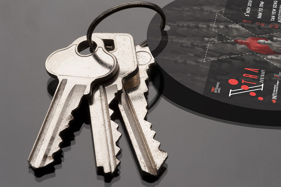
Tickets were initially designed to portray a subliminal message on being an extraordinary individual out of the crowd. However, the team decided on its interactivity and a new idea for the design is to give it a new life after the event, which is to provide memories of it, as this is the first time it is organised.
For the T-shirts, there are limitations to the possible design due to the franchise guidelines.


Speakers photos are cropped from their background, desaturated with level adjustments to increase their contrast between the dark and bright portion of their face

A human head model downloaded from internet sources and were sliced into half for use in final video

Placing point on the intersections of the model wireframes and emulating the face mapping effect.

Similar to the previous process, the method is used with the photo of the speaker imposed on the separated model.

Combining 2 compositions together, the red marker indicates the focal point of the camera when the speaker come into focus


SPEAKER INTRODUCTION & PROCESS
12 separate animations was made to present all the speakers on stage and also for countdown purposes to be publicized on social media.


EVENT TITLE SEQUENCE
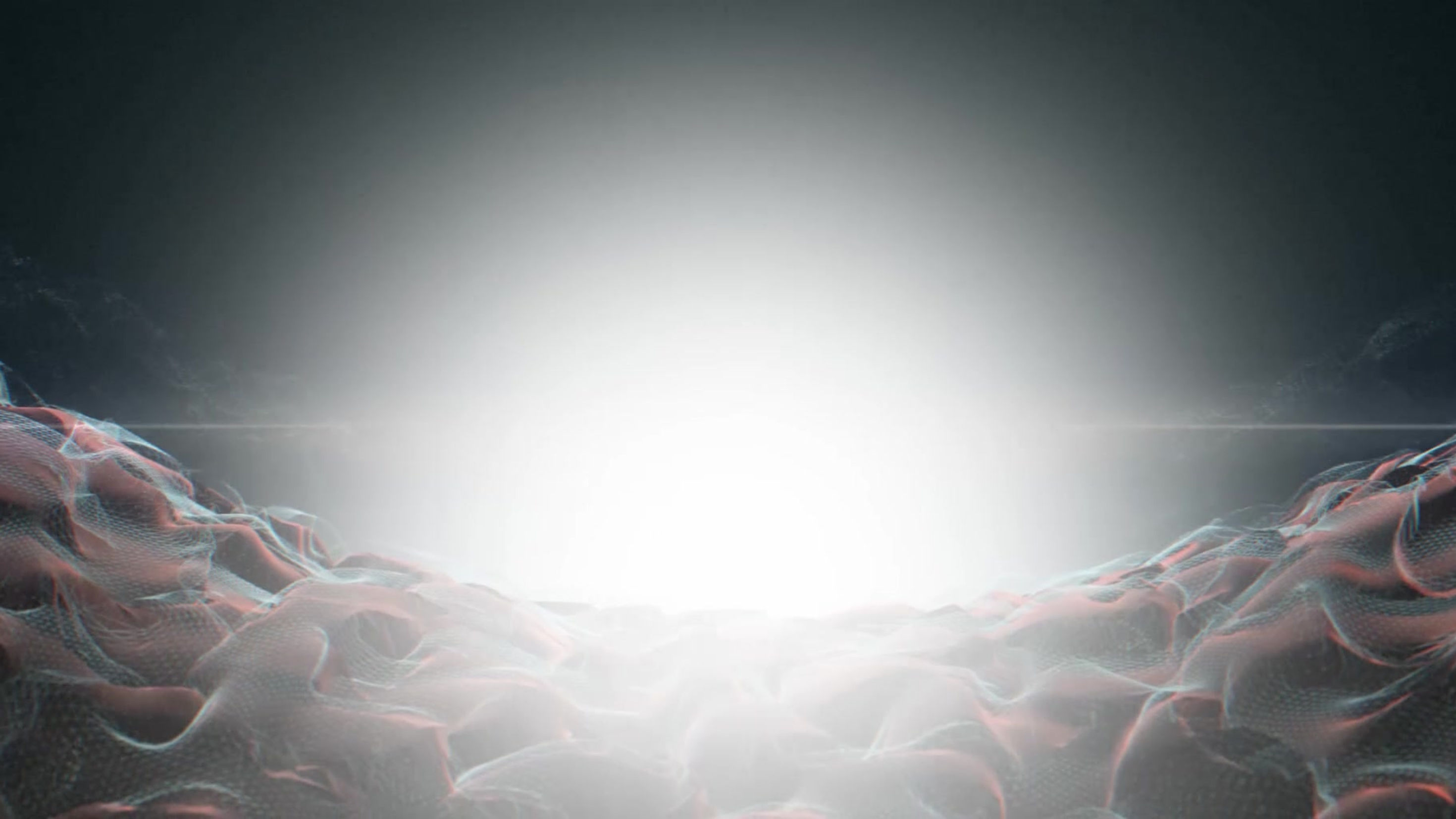
The animation for the introduction of the event was made as a title sequence to all speakers while showing the concept come into place. Instead of explicitly creating a documentary of childbirth through the introduction of 'Xtraordinary' nucleotide, a more abstract representation of different races, traits and species were done in a form of a fabric to symbolize a civilization, contributing 'ideas worth spreading' in INTI International College Subang.

Object in the animations are rendered in 3D space and are animated.

Colours and shaders are added to the model to give it both ideal and planned representation

Lighting and shadows are added to increase the sense of depth and space while portraying its interaction to the environment.

Enhanced super-sampling, anti-aliasing, motion blur and depth of field are added to the render.

Artificial environment/ambient lighting were added

Final imperfection such as lens flare, grain and chromatic aberration were added to increase photo-realism.
EVENT TITLE SEQUENCE - PROCESS
The animation took over 3 weeks to complete as there isn't a team to distribute tasks to. Ranging from modelling, animating, coloring, shading, lighting, to final touches, everything was done by a single person as there aren't any other designers with such expertise.


The process of the entire animation is rather similar to the Title Sequence and Speaker Introduction with the exception that this starts with a stock footage from Pexel Videos due to the lack of professional videography equipment.

Object in the animations are then rendered in 3D space and are animated.

Colours and shaders are then added to the model to represent materials.

Enhanced super-sampling, anti-aliasing, motion blur and depth of field are added to the render.

Lighting and shadows are added and animated to increase the sense of depth and space while portraying its interaction to the environment.

Ambient occlusion added to give a greater contrast between separate parts while providing a proper bounce of shadows.

Final imperfection such as grain and chromatic aberration were added to increase photo-realism.

To project the hologram light source animation properly, a camera was placed to in front of the camera with the projected hologram in the middle of the focal line.

From the line of projection prepared in the previous composition, light streak is added based on the position of a null object. The distance of the null object from the source determine the size of the projection.
EVENT COUNTDOWN & PROCESS
The intention of making this uniquely themed animation was to capture attention of the public on social media. This animation was made to announce the countdown for the event TEDxINTISubang and was done purely for the sake of self-improvement and the discovery of new methods of animation.


The expansive space allow this illustration to be used as either a profile picture or cover photo.

The body content of the illustration are used to interact with the background.

In order to bring balance to the generous allocation of space, most of the illustrations are placed below while maintaining the essence of the background which highly prioritize emptiness.

The balanced composition of the image is complemented but the centralized arrangement of the body content.

Following the direction of the fold of the abstract fabric, the logo at the side was brought closer to the audience while the details of the content was brought backwards.

To achieve consistency of the theme design, image was also used as a background in the collaboration poster with TEDxKL.