

GRAD SHOW : BEYOND THE GRIDS
As a student pursuing his final year studies, I was among the few to be given the task to prepare graphical solutions and a theme to the Graduation Show. This would make the project to be categorized under branding. The project took several attempt to have it's concept finalized as every tutorial session leads to a demand for a theme change.

Colour is an essential component of design. typically for graphic designers, they would either encounter CMYK or RGB colour palette. Separating them in a much more subtle way, various shapes and arrangements are made for experimental purposes.

This development is for an illustration that symbolizes image. The use of an aperture as a symbol had been decided as it has been the vital component to all camera but yet maintains the same form.

An attempt to incorporate the word GRAD SHOW with interaction to the aperture.

Venturing layouts of the collaboration between Sheffield Hallam and INTI International University.

First attempt to merge all developments

Second attempt to merge all developments

Third attempt to merge all developments.

Final attempt to merge all developments. The idea was then rejected by the module leader.
CONCEPT 1 : GRAPHIC DESIGN ELEMENTS
The first concept that occurred was inspired by the elements that graphic designers would typically consider as a medium to provide a final outcome, such as typography, image, colours and illustrations.the images above shows the development towards the idea. Descriptions and justifications will be provided in each image. The development was rejected but the outcome of the development was the determination on a choice of font, Ikaros Sans.

The first step to this concept is to prepare a few different sizes of maze, which also determines the differences in their respective complexity.

Laying out title of the event through experimental process.

Combining both words for 'GRAD SHOW' for the while simulating a maze through some 'openings' and merged characters for the 'dead-ended walls'.

Placing everything together in a straight forward manner. The chosen image is a portrait of a masked man, which signifies an unknown identity.

The first poster is an attempt to deal with laying out the titles using negative spaces. The second poster was an attempt to shrink the image down to a passport-sized photo to emulate the size of an identification photo in relation to the size of the background. The map is placed in such a way that it is similar to a stamping process on an identification paper or passport.

The first poster deals with the inclusion of maze with the titles which utilises the negative space layout. The second poster places the word 'SHOW' in the confined space of the word 'GRAD'.

These attempts are variations to the previous 6 attempts.
CONCEPT 2 : IDENTITY - MAZE
Inspired by the idea that each designer should be unique, the abstraction of the concept would be a maze. Why maze? A maze had always been associated for being lost. For one to find their way out of it would be the meaning of finding oneself as a designer. The style, the character, the tones and the form. Descriptions and justifications will be provided in each image. The development was rejected but the outcome of the development was the form of the typographic arrangement in later development.

The idea is to impose and image of the students face on a finger print. To simulate inked thumb print, thicker prints are used. The thinner lines will represent highlights on the students face while the thicker line represents the shadows.

Placing the imposed image on previous theme's layout.

Experimental attempt to use new fonts with similar layout and attempt to use a less monotonous colour to give a striking contrast for the image of the fingerprint.

Application loading interface. A much bolder choice of colour is being used such as the highlighted cyan.

This development was done to venture into a different style of illustration, which is using lines as a divider. Second attempt was heavily inspired by Google's Material Design through the use of drop shadows on the User Interface (UI) of the application, specifically the list of menu.
CONCEPT 3 : IDENTITY - FINGERPRINT
Using the same concept with a different abstract representation, fingerprints were chosen to be the face of the theme. Once again, the idea was rejected and the outcome of the development is the choice of highlighted colours to signify bold choices that designers make in their illustrations which sets them apart from a typical person who is not a practitioner. This development also venture into a different style of illustration, which is heavily inspired by Google's Material Design through the use of drop shadows on the User Interface (UI) of the application, specifically the list of menu. Descriptions and justifications will be provided in each image.


CONCEPT 4 : IDENTITY - GRADIENTS
Using the same concept with a different abstract representation for the third time, gradients chosen to be the face of the theme. The frustration of dealing with repeated rejection was apparently reflected on the deteriorating quality and a somewhat incomplete final products. No words were mentioned whether these developments were taken into consideration for the first half of the grading. The idea was not well accepted and the outcome of the development is the choice of highlighted colours with the same reason as the previous concept, except this time there are gradients of highlighted colours. The gradient of the 2 contrasting colors, both turqoise and cyan were used to signify the collaboration of Sheffield Hallam and INTI International College Subang which dedicates the event to both Graphic and Interior Design students. The choice of fonts are more complete now for respective purposes.

Before attempting the concept, inspirations and examples on the application of grids were taken from the internet. This compilation shows how they can be used in dimensional manipulation such as rotation, scaling, warping and colour shift.

The second compilation shows the various compositions, layouts, form and function of the grids were utilised.

The third compilation shows how both previous form and ways of application are combined together to signify the presence of grids in a composition.
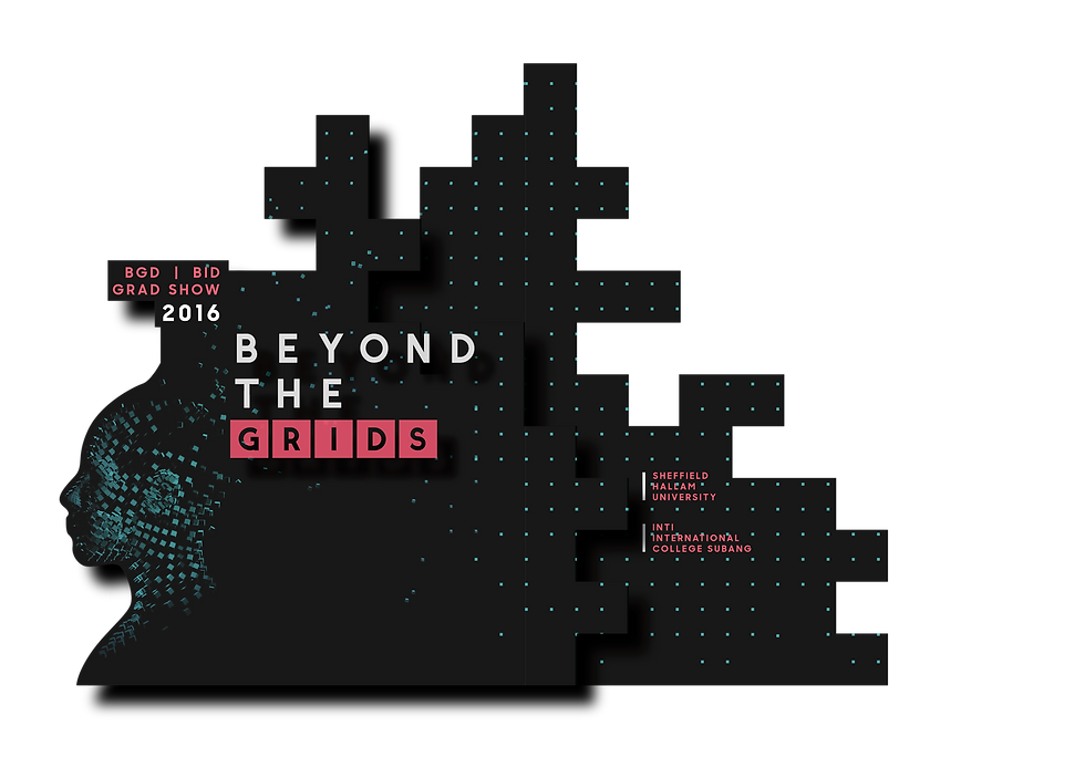
FINAL CONCEPT : BEYOND THE GRIDS
With all the justified outcomes from previous concepts and developments, the project finally reached an end with the latest concept which unifies both Graphic and Interior Design students identity into one - which is the use of grids. Grids have been constantly used as a guideline by both designers for spatial management and alignments of their compositions.
The first step to this attempt is to look for examples and study the different ways that grids can be applied within a very confined time limit. Despite the approaching deadline, studying these applications are still as important as perseverance. More explanations are available in the images above.


LOGO
Grids are typically divided into units or sub-units as shown in the examples. Using that very observation, a new logo had been hatched with the aid of software for generating a random dispersion pattern. However, it heavily affects legibility. More to that, it also made the logo to be unnecessarily complex and therefore, a more minimal solution had been chosen.

This is an attempt of illustrating background of the layout using a special technique to animate the grids is a randomly dispersing manner.

An alternative to the previous illustration, this attempt deals with different size, more space management but equally ineffective as a proper background. More will be explained in the LAYOUTS segment.

Instead of being blatantly ambiguous with the dispersed grids, a better representation were planned. It involves and begins with us, as humans. A 3D model was used and assigned material for the representation.

The idea is to make the dispersed grids to be hatched into a human head, which represents us as a designer. However, visibility is still a huge issue despite the saturated placement of ambient lights.

Being grey and silver, the previous material obviously doesn't reflect light well, which in turn, less of its colour can be seen. Using the same colour code assigned in the gradient's cyan, a new colour is used.

After the new material selection, the difference is apparent. The visibility of the subject matter was explicit in relation to its background.

This is a frame saved from the hatching, showing the higher degree of contrast with just s simple material and colour reassignment.

The same material is displayed very well in white backgrounds too.

With such a high functioning illustration, it is chosen to be the new background instead.
ILLUSTRATIONS
The illustrations are mainly done to convey a message of us graduating from being 'confined within our grids'. It is used as a metaphor of the graduates being independent from their educational institutions and ready to face the real world. The background of the layout initially maintained a similar method of illustration where the grids are dispersing through the aid of software. Instead of being non-objective and overly abstract, a more straight forward illustration was opted where the grids would disperse and mold into a human.

Using the gradient technique clearly makes the important information to be illegible. More to that, the illustrations are less visible due to the nature of the thin lines of the grids.

No matter how the background is altered or how the layout is planned, visibility is simply a huge problem to solve. The background is overwhelmingly empty due to the lack of contrast between the illustration and the space around it.

Testing out a non-gradient layout, the difference is apparent. In addition to the different illustration style, the colours can be maintained too.

An alternative layout to the previous attempt to fit in a tag for event crew.

With the new proof of concept, a new style of design is developed for the project and this is the first look of the poster. It utilised the same colour, new background but with better contrast between each elements which is planned harmoniously without hindering legibility and focus.
LAYOUT & COLOUR SCHEME
Previous development which involves the use of gradients are practically unusable in this layout due to the wide range of brightness levels. On a dark background, parts of the logo appear too dark and hard to read and on bright background, parts of it appear too bright. However without an image, the lines of the grid may be either too dark or it distracts the components on top of it. as shown above. To solve these problem, the foreground and background illustration was assigned opposing colors for maximum contrast with minimal distraction. The foreground illustrations are mainly hot pink and white while the background illustrations used the combination of black and cyan.

The process of making the poster

The process of making banner.

In order to convey the message of the chosen theme, the invitation card is built in such a way that is is 'beyond' the intended dimensions of a typical 2-sided card. A pop up card is designed based on multiple layers and while simulating Material Design with real materials. Markers of different colours are used to indicate different layers of the popup.

The layout of the external cover is designed with the back page emptied for sponsors' logo and messages.

The internals are designed using the illustrations prepared from the previous sections.

Using the same background of the base cover, some information of the event are added to the layout. This layer follows the green indicator as planned beforehand.
Second layer was added following the shape of the blue marker.

The addition of the third layer is to complete the spaces filled by the pink marker.
CONSTRUCTION OF FINAL OUTCOMES
This segment shows the process of constructing the final outcomes, preparation of the layout using proper grids, and the rationale behind each design.


