

ALIENWARE RE-BRANDING GUIDELINE ANIMATION
A significant percentage of gamer have entered life stages with matured wants and needs. They have higher exposure to advertising and have a refined expectation a leading brand. Along with their audience, Alienware now redefine themselves as a high-end gaming and technology brand.


INITIAL PLAN
The initial plan was to redesign the branding guideline as part of the 20th anniversary initiative. However, the developments of the design was considered void when Alienware had came up with their own branding guideline before completion.


LOGO
The logo is updated for a refined look. The ‘A’ is used as a spacing guide. The logo should never be smaller than 0.3 inches or 75 pixels. It should also be placed on a contrasting background to reflect distinction. The expansion of the typeface also serve as hint of immersion.

This layout shows a prominent monochromatic colour scheme and a faint vignette as a background instead of a perfectly white one.

Also with vignette and a monochromatic colour scheme, some colours from the game screenshots were added to the mix, along with the colours of the LED accent of the product.

Similar to the previous page, the colours mainly come from the product's LED accents. Instead of a perfect black background, a dark gray is used instead.

The brand should be primarily monochromatic but subtle tints of colours or vignette are permitted. Black backgrounds are now replaced by dark grey to reduce contrast. Gradients are used sparingly. The colour palette are only for prints. If product accents are coloured, use a neutral colour such as grey and white, and vice versa.
COLOURS
The brand should be primarily monochromatic but subtle tints of colours or vignette are permitted. Black backgrounds are now replaced by dark grey to reduce contrast. Gradients are used sparingly. Such parameters are mainly seen on the official website, which is the main channel where the branding design is frequently seen by the intended target audience. The colour palette are only for prints. If product accents are coloured, a neutral colour such as grey and white will be used, and vice versa.

The headlines should use Avenir Next LT Pro Demi, with tracking set 100 or more and the body texts, Avenir Next LT Pro Regular, with tracking between 0 to 25, and no less than 9 points. The overall weight should feel light and futuristic. Heavy weights, condensed and italics should be used sparingly.

Where it is not possible to use the brand’s typeface, Open Sans should be employed. Similar spacing should be used online for maintaining a consistent visual style across all media.

The display typeface for the brand Bebas Neue. It is only used for product names or event badges. It is less generously spaced compared to body texts or headlines. Tracking should be set at or less than 25.
TYPEFACES
The overall choice of typefaces are dependent of the similarity between the prints and web typefaces. Mostly, The massages have generous amount of space and tracking for an expansive impression. More will be elaborated in the images.


LAYOUT
Equidistant objects are preferred in spacing. It should be laid to give an ‘airy’ impression through a generous beyond 10 point line and letter spacing to improve symmetry and legibility.
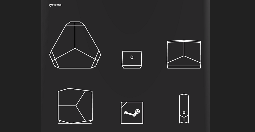
ILLUSTRATIONS
The illustrations are mainly vector-styled. They are clean and simple while paying strong attention to symmetry of the products.


ANIMATION STYLE
The style of the narrative video is mainly focused on the mixture of motion graphics and visual effects. In conjunction to the rebranding, the videos uses fluids as the motive, with spacious and clean setting. They typically dissect the subject matter in an exploded view. The duration of the videos are approximately 1 minute.
MUSIC
The current line of promotional videos utilises retro-styled electronic music. The tone mostly focus on the solem immersion, futuristic direction with a hint of transcendence to its tune. The music used will be from a game; Hotline Miami 2 - Remorse.


TRACING THE LOGO
The new Alienware logo have a minute structural changes to the alien head and the text no longer come in a preset font. There is also no mention in the guide regarding which font were taken for reference. Therefore, tracing is vital prior to animation for a high quality illustration.

TRACING THE ILLUSTRATIONS
The illustrations are mainly vector-styled. They are clean and simple while paying strong attention to symmetry of the products.

This scene is direct reflection of their animation style for the product Aurora.


It mainly utilises fluid as the motive to show immersion and also liquid cooling system.

Scene shows the structural change to the alien head of the logo.

Close ups when portraying a product/subject matter as seen in promotional videos for Aurora, Laptops, and Alpha (as of late 2016).

Another close up scene when portraying the logo as seen in promotional videos for Alienware Laptops (as of late 2016).

The way it focuses the logo simulates the vertically shifting view from a hovering spaceship as direct influence from their choreography.

Clean and white setting displays Alienware official print colour palette.

A less wobbly perspective is opted for this scene as a direct influence from Aurora promotional video.

The page-sliding scene is to simulate how they display information in Alienware website. From the speed to the acceleration and deceleration, everything was carefully observed to maintain the brand identity.

Exploded view are typical in their promotional videos, photography, and website illustrations.


